PS App's New UI Has Players Fuming: "A Downgrade"
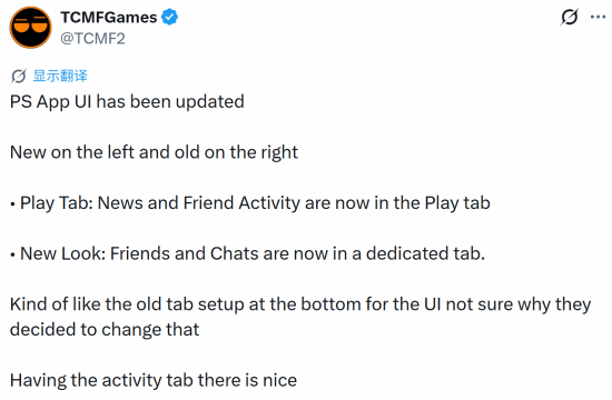
Sony's PS App just got a fresh coat of paint, but players aren't happy. Many are calling the new look generic and a step backward from the old design.
Sony just rolled out a new look for the PS App, and let's just say... not everyone's thrilled.
The redesign reshuffles the mobile app's layout in some pretty noticeable ways. The big change? News and friend activity now live together under a single "Play" tab, while your friends list and chat get their own separate tabs. The bottom navigation bar also returns to an older-style tab layout that longtime users might recognize.
Well-known gaming blogger TCMFGames shared side-by-side screenshots of the old and new interfaces, sparking a wave of discussion. The blogger actually liked one part of the change: giving friend activity its own dedicated space. But they also questioned whether the overhaul was really necessary in the first place.
And judging by the reaction overseas, plenty of players are asking the same thing — except with a lot less diplomacy. The comments have been brutal, with many calling the new design a visual downgrade. Some say it feels generic, stripped of the personality that used to make Sony's interface stand out. Others put it bluntly: it's uglier than before.
So what's actually different? The shift brings the app closer to a more standardized, streamlined look — the kind you might see in plenty of other apps. For some, that's fine. For others, it's exactly the problem. Sony's software has often had a distinct feel, and this update trades some of that character for a cleaner, more uniform layout.
It's worth noting this is purely a visual and organizational change. The core features — checking news, seeing what your friends are playing, jumping into chats — are all still there. They're just arranged differently. Whether that arrangement feels intuitive or annoying probably depends on how you use the app day to day.
Of course, UI debates are nothing new in gaming. Every platform update seems to split the community, and "they ruined it" is practically a tradition at this point. But the volume of pushback here suggests Sony might have missed the mark with at least part of its user base.
So, where do you land? Did Sony fumble the redesign, or are people overreacting to a few moved buttons? Drop your take in the comments — we're curious which version you'd pick.
📰 Related Articles
Capcom Fall Sale: Monster Hunter Rise Just NT$119
Are you finally picking up Monster Hunter Rise, or is something from the Resident Evil lineup calling your name? Let us know!
Bayonetta's Future: What PlatinumGames' CEO Teases Means for…
For players, this means Bayonetta's story might continue, but any new game depends on navigating co-ownership and a changed development team. It also highlights PlatinumGames' balancing act between le…
Star Wars Zero Company Discounted: What It Means for Your Wa…
This discount makes the critically acclaimed tactical game more accessible to players, potentially boosting its player base ahead of the holiday season.
What Xbox's Ninja Theory Closure Means for Hellblade Fans
The closure means Hellblade fans may never see the studio's in-progress project, and the wider Xbox restructure signals more layoffs could hit other beloved teams in the coming months.
VR Diablo 2 Mod: What It Means for Players
This mod shows the potential for VR in classic ARPGs, but also highlights the challenges of modding online-only games. It may inspire future official VR support or discourage modders due to technical…
Resident Evil Requiem Hits $50: What It Means for Your Walle…
This deal gives players a chance to grab a top-rated survival horror game at its lowest price yet, with no Prime membership required. It also signals that retailers are ramping up competition ahead of…